The Top 10 MediaWiki skins
26. July 2017
Vector, Chameleon, Foreground and many more: We have looked around to find interesting skins that are currently available for MediaWiki. Here are the top ten from our point of view.
Richard Heigl
CEO of Hallo Welt! GmbH, historian, Wiki expert, book author and speaker. Born in 1971 in Ettal (Bavaria), he now lives in Regensburg and regularly blogs and tweets on the topics of wiki, social web and information technologies.
When comparing new MediaWiki skins, you always come across three themes:
- Mobile: How do the skins support mobile applications? Many skin developers rely on standard HTML, CSS and JavaScript frameworks like Bootstrap or Zurb to create responsive “Mobile First” skins.
- Navigation: The orientation towards mobile has significant consequences for layout and design. It becomes “flatter”. Editing functions move into the background to avoid overloading the small screens and reduce complexity. This makes the pages more attractive for web presences and the “mobile first” skins are more beautiful – especially for the reader. The power user who wants to work with the wiki finds such skins rather problematic, because he can only access important functions with additional clicks.
- Semantic support: Many wikis use Semantic MediaWiki to work with metadata. Individual skins integrate functions of the corresponding semantic extensions into the skin or adapt the design so that there are no visual breaks.
Let’s just have a look at some skins:
1. Vector und MobileFrontend
Let’s start with the MediaWiki skin, which is also used by the Wikimedia projects. Vector has been the default skin for MediaWiki since 2010. It has many supporters and fans because it is well maintained, simple and functional.
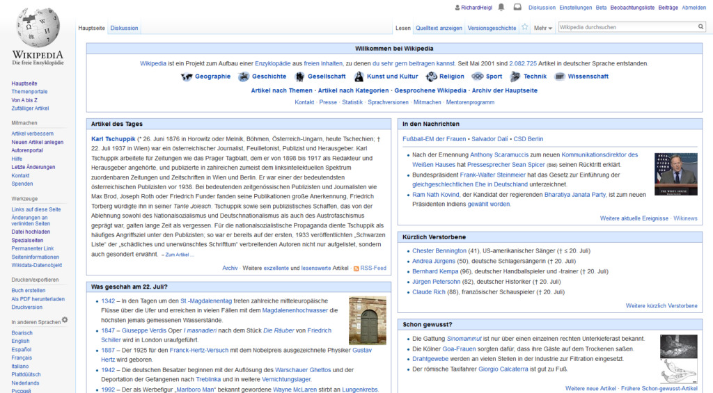
Screenshot: Vector is the skin of Wikipedia since 2010.
Personally, I think the Vector design is no longer up to date. But contrary to my hopes a few years ago, unfortunately not much has changed here. The Wikimedia Foundation has lost sight of the development of a new standard skin for MediaWiki.
Vector has been further developed for mobile devices, but is not fully responsive. Mobility is supported by Wikimedia with the extension MobileFrontend and the corresponding mobile skin Minerva. Mobile devices automatically switch to the mobile skin. Compared to other skins like Vector, Minerva offers a much simpler user interface and relies mainly on good performance to meet the requirements of readers with mobile devices.
Another way Wikimedia supports mobile applications are their Wikimedia Apps, which are really very successful and should perhaps be the subject of another article.
For projects outside of Wikimedia, Vector is still very useful. MobileFrontend also performs very well. However, the projects are very much tailored to Wikimedia, which makes it very difficult for web developers to bring in innovations and own developments.
Links:
- MediaWiki.org: Vector, MobileFrontend, Minerva Neue.
2. Chameleon
Chameleon is a highly customizable, well documented and responsive MediaWiki skin based on Twitter Bootstrap 3.
By default, Chameleon offers a horizontal navigation menu with dropdowns at the top of a page and a horizontal menu with dropups for language links at the bottom of the page. Chameleon offers five different layouts to choose from. Each layout is defined in an XML file and as such is easily adaptable to different needs. The examples below illustrate the range of layout and design possibilities with Chameleon.
We use Chameleon from time to time for customer projects and it is expected to become the technological basis for BlueSpice skin 3. Chameleon can also be found on many websites that have Semantic MediaWiki installed.
Links:
- MediaWiki.org: Chameleon
- Examples (Demos):
- Physiopedia (a customer project from us with an additional static homepage)
- Wikifab (a wiki for tutorials)
- Help Wiki of the Evergreen State College
- Docupedia (Dictionary of contemporary historical research)
- OGD Cockpit
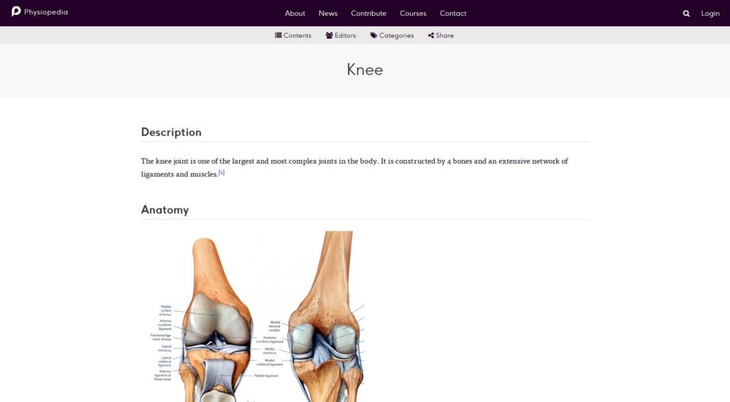
Screenshot: The Chameleon skin at Physiopedia
3. Foreground
The well-documented skin was developed to bring the content into the foreground (“Foreground”).
It has a responsive layout and supports Semantic MediaWiki. Foreground is based on the Zurb Foundation Framework and thus on an advanced, attractive front-end framework.
The developers have largely reduced the menus and navigation elements. The left menu is integrated into the top navigation. The toolbox and personal settings can also be found there. The page actions (“Edit”, “Move”, “Watch”) and the link to the discussion page are also only accessible via a button (“Actions”).
Currently we are working on a version 2. A release date for a stable version was not known at the time of going to press.
Links:
- Homepage and demo: Foreground
- MediaWiki.org: Foreground
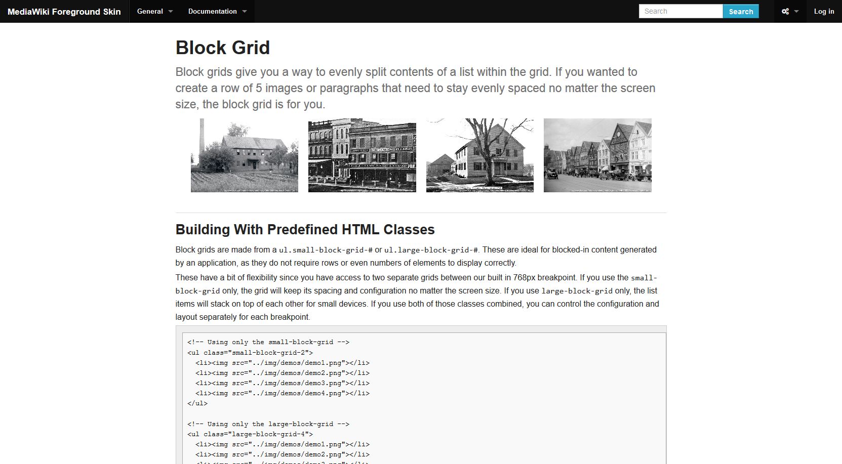
Foreground: A new version is currently in progress.
4. Pivot
The pivot skin also follows a “mobile first” approach. Like Foreground Skin, Pivot is based on the Zurb Foundation framework. The well documented skin not only supports modern layout development, but also Semantic MediaWiki.
Unlike Foreground, Pivot retains the “Wikipedia” layout. Even the search field has moved back to the left navigation like in the early days of MediaWiki (see Metrolook below). The reduction of the page and user functions to one button provides a calm look.
Links:
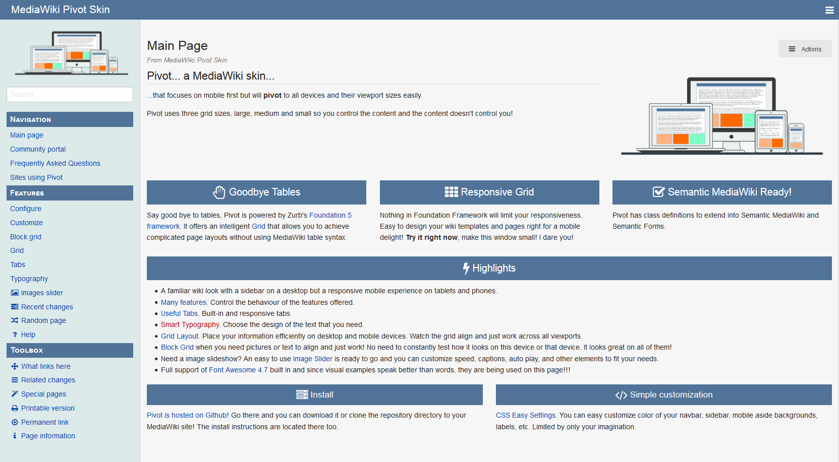
The homepage of the pivot skin
5. Tweeki
Like Chameleon, Tweeki is based on Twitter Bootstrap. The developers of this skin try to implement as much bootstrap functionality as possible so that it can be used very easily with very reduced markup and offers many configuration options.
Tweeki aims for maximum compatibility with Semantic MediaWiki and PageForms and is especially useful for “wikis as websites” projects. Accordingly, all navigation elements are arranged in the top navigation. The navigation within the article, which is also known from Wikipedia, is dynamically moved to the right margin. This skin is also very well documented.
Links
- Tweeki: Homepage and demo
- MediaWiki.org: Tweeki
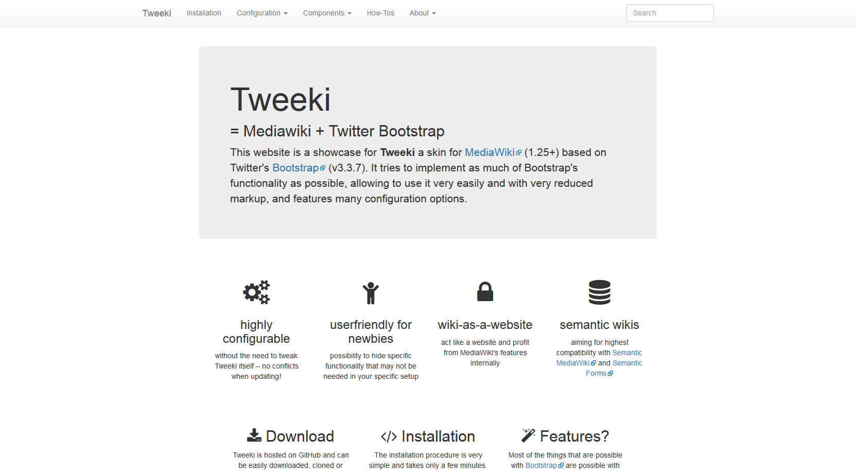
The Tweeki skin
6. Dgraph
Dgraph was developed to design the Wiki of a graphical database software.
The skin supports responsive layout. Like many younger skins, Dgraph presents itself in a very reduced form and is styled for use in the corporate environment. It directs the focus to the header area, which ends with a horizontal navigation bar. The menus, search, page functions and personal pages are integrated in this bar.
Links:
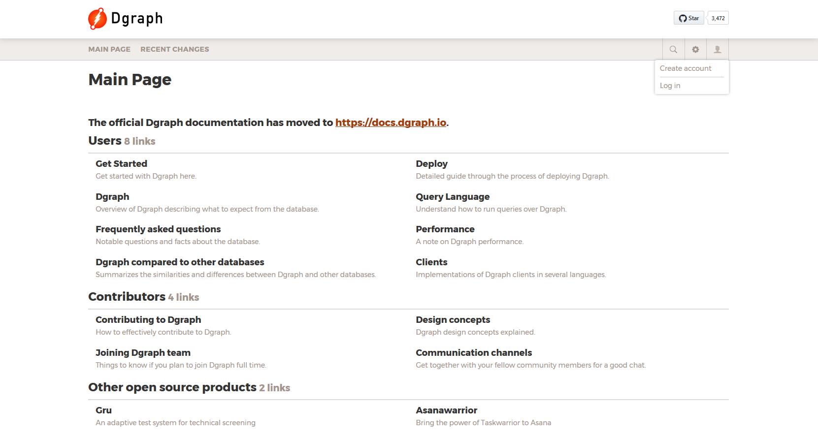
Screenshot: Dgraph comes from the corporate world
7. Timeless
Timeless is a very cheerfully designed skin and was created in the course of the discussion about a new look for Wikipedia. Its layout seeks the balance between editing and content elements.
Thus Timeless is based on the Wikipedia style, keeps the central navigation on the left side, but arranges page functions, the toolbox and categories in a right column. The content area is moved up by Timeless to avoid wasting space and you even gain space for a large search box.
Responsive behavior is partially present, but not yet fully implemented. Interesting: In the demo linked below Timeless for mobile applications works together with MobileFrontend and Minerva.
Links:
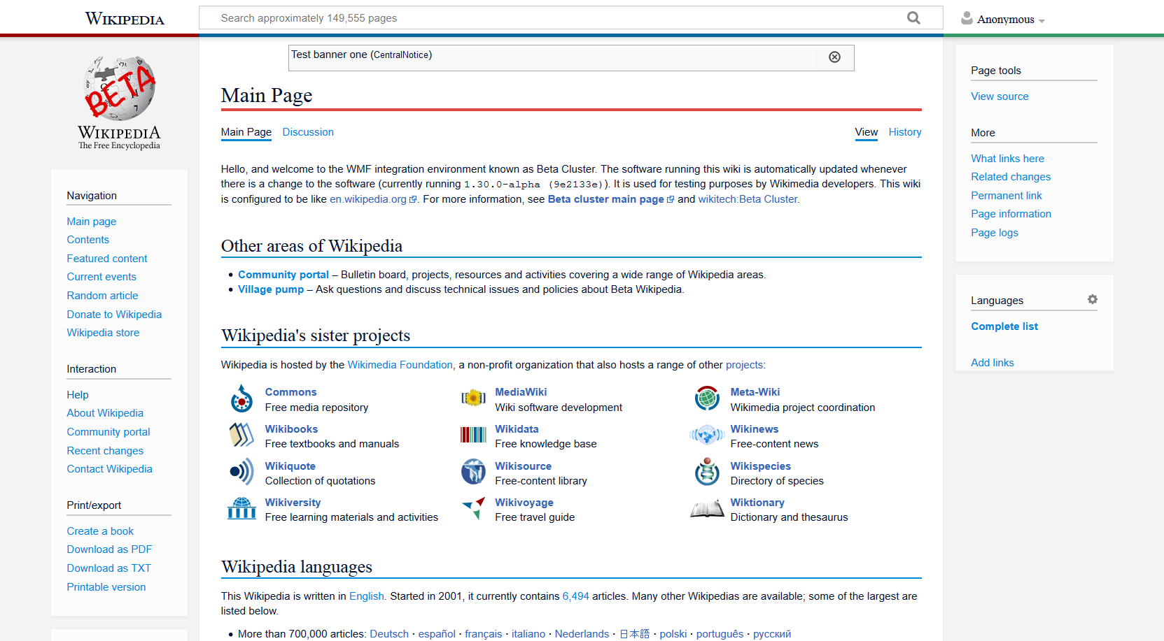
Screenshot: Timeless supports readers and authors alike
8. Metrolook
Metrolook is also a fork of the Vector skin, which is based on Metro, an unofficial Microsoft design language. It was written for a database of video game images (PidgiWiki).
Metrolook is fully responsive. The configuration options are well documented.
For use as a collection of image files, an upload option is provided in the navigation at the top of each page. In this top navigation you can also find the page functions and the user functions, which is a bit unusual. The left menu bar is kept as in Wikipedia.
Links
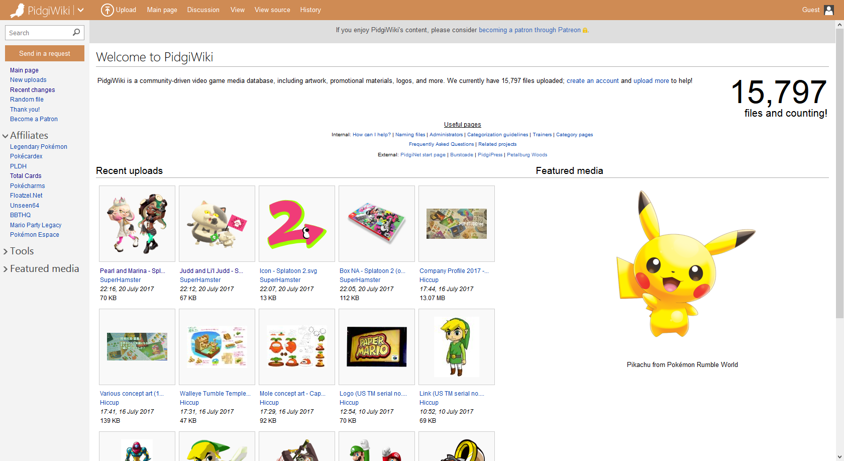
Screenshot: The Metrolook skin
9. Gamepress
Gamepress transfers design ideas of the WordPress skin of the same name to MediaWiki.
This skin cannot hide its origin from the gamer scene. It is well suited for the documentation of games, but also for wikis with a proximity to the media world (photo, film). The black Gamepress skin is also interesting for technical communities.
The central navigation is placed on top. It offers a drop down menu. On the right, as in a classic blog, a second navigation bar is arranged, which also contains search, user and page functions. The three-column footer offers further design space.
In the standard system the skin comes in four design colors: red, blue, green, and orange. Gamepress deliberately does not provide space for a logo, but displays the name of the wiki.
Links
- Beispiele (Demos):
- MediaWiki.org: Gamepress
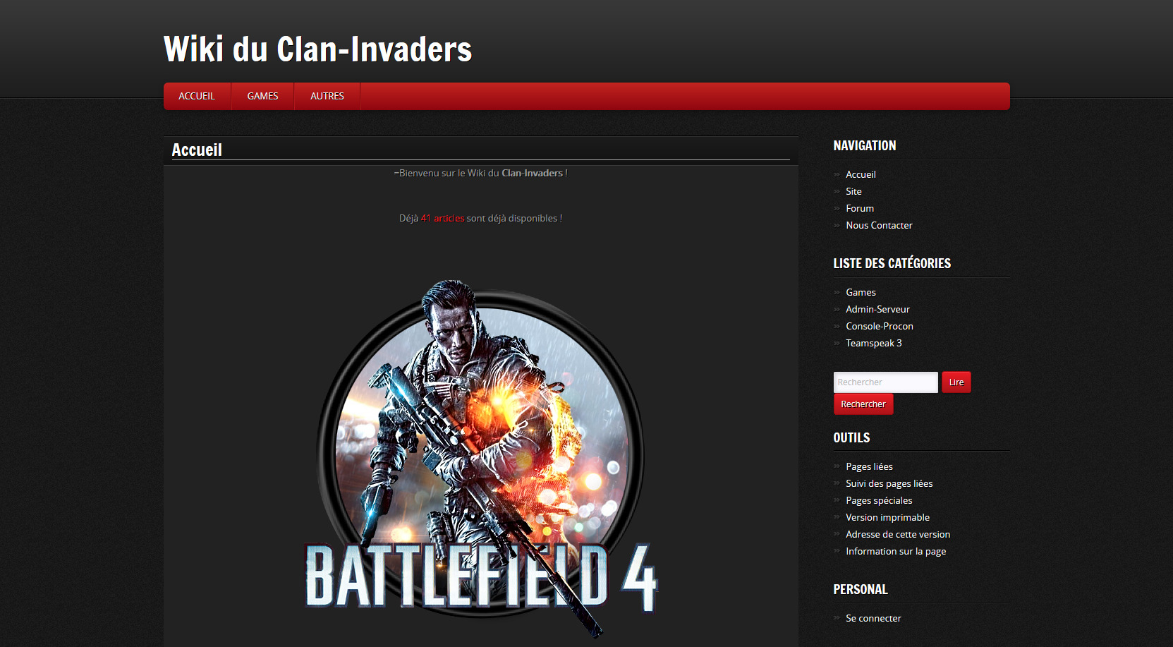
Screenshot:Gamepress for wiki owners that prefer a dark look.
10. Skins of web projects
The skin (MediaWiki Bootstrapskin), which is intended for tenth place, is unfortunately not available at the moment. Therefore I take the opportunity to point out projects that I noticed while researching this article.
These are very nice individual skins, but to my knowledge they are not optional. They are nevertheless very interesting as a source of ideas for web designers and wiki maintainers.
- Ryte Wiki: (formerly OnPage) is a website optimization company. The company has created a wiki on the topic of digital marketing. An overall very nicely designed individual page.
- Energypedia: A platform for collaborative exchange on renewable energy and energy efficiency in developing countries
- WikiWand: In general, the Wikipedia reader WikiWand is also a source of ideas for beautiful web frontends.
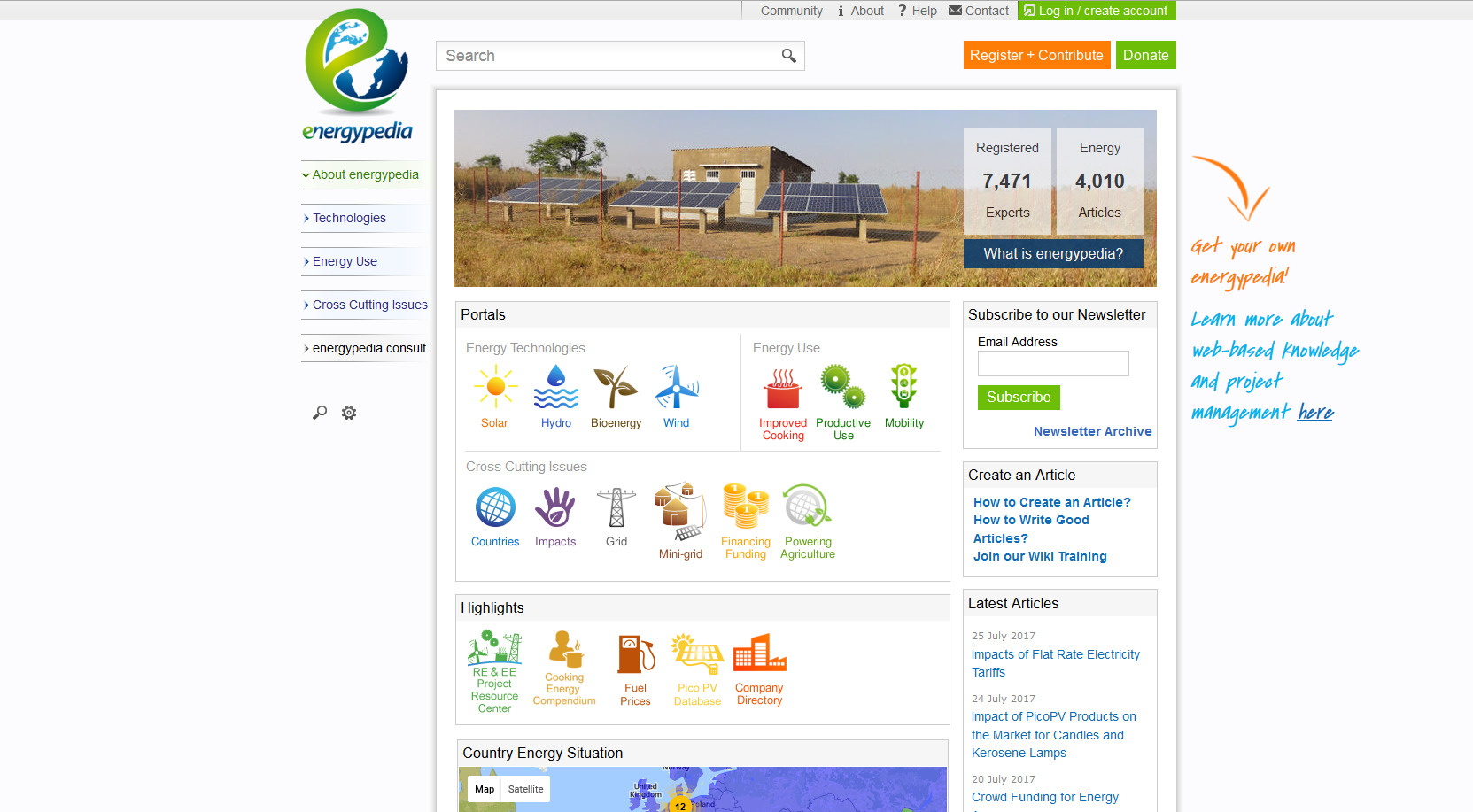
Energypedia – Example for a successful individual skin design
BlueSpice skins
Another personal note:
Our MediaWiki distribution BlueSpice (Demo) requires an adapted skin, because additional functions like the user menu of BlueSpice have to be mapped. The skins mentioned here would still have to be adapted for BlueSpice. Hallo Welt! is of course happy about corresponding orders. But we are also happy to support developers who want to become active here independently, in order to be able to offer their customers and users of BlueSpice skin alternatives.
WikiApiary, a project of the MediaWiki Stakeholder’s Group, captures public wikis, including the distribution of skins and extensions.
Share This Story, Choose Your Platform!
| Except where otherwise noted, news on this site is licensed under a Creative Commons Attribution 4.0 International license. |


